
Thoughts on Inflation
Why inflation has not been beat and future rate cuts are unlikely.


I have studied aspects of the American economic and political landscape for more than 25 years as a hobby. I focused mostly on the stock market at first. When researching historical market values, I noted a stock market cycle, which I wrote about in my first webpage in 1997. In that webpage I forecasted the end of what I called the Reagan bull market to peak at a Dow Jones index value of 9000-12500 around 1999.
I happened upon the Longwaves discussion site (now defunct) in 1999, where mostly financial newsletter writers exchanged views about the economic long wave, also known as the Kondratieff cycle. In just a few months I had learned a great deal about Kondratieffs and related cycles like Quincy Wright’s War Cycle. I found my stock market cycle corresponded to a half Kondratieff cycle.
One of the problems with the Kondratieff literature was an absence of recent empirical demonstration of this cycle. Kondratieff’s initial demonstration was based on long-term trends in commodity prices and interest rates which did show fifty year cycles. For example, US prices showed peaks around 1814, 1864 and 1920, and troughs around 1790, 1843 and 1896. Commodity prices stopped showing cycles after 1932, showing a more or less continuous rising trend since then. As a result, it was not clear whether there still was a Kondratieff cycle.
Interest rates continued to cycle after the 1920 peak with a trough in 1946 and another peak in 1981. Furthermore, students of stock market cycles like the participants at Longwaves noted secular bear market bottoms in 1949 and 1982 that were close to the Kondratieff interest rate turning points. Various Kondratieff scholars had proposed dates for the post-1920 trough ranging from 1932 to 1954 and dates for the subsequent peak from 1970 to 1990. It would be good to have unambiguous cycle dates based on price for comparison to interest rate and stock market dating. To this end I developed the reduced-price model.

Table 1. Inflation levels and deficit spending during wartime and peacetime 1688-1918
The reduced-price model
As cycles in prices, Kondratieffs are also cycles in inflation. Table 1 presents average wartime and peacetime inflation rates and national debt growth rates in Britain and America over two and a half centuries. It is clear that inflation was higher during wartime, as was growth in national debt. This war-inflation and debt pattern shown can be formalized using the quantity theory of money:
1. rGDP P = V M
Here, rGDP is real economic output, P is the price level in dollars per unit of output, M is the supply of money in dollars, and V is the velocity of money circulation, which has units of reciprocal years (yr-1). The left-hand side of equation 1 expresses economic activity as a “money flow” in dollars per year that is equal to the product of real output (rGDP) and the price of that output (P). The right-hand side is also a money flow, the product of M and V. Thus, the quantity theory of money is just a balance on flows of money. Equation 1 isn’t really a theory, but rather an identity based on the definitions of M and V. Money is often seen as a physical thing, coins or paper currency. Coinage first appeared in ancient Lydia around 600 BCE, but credit and interest on loans are far older. Since one can buy with credit as well as coins, money is not necessarily just gold, silver or currency, but can also be credit. US paper currency is explicitly credit-money called Federal Reserve Notes.
Table 1 suggests that wartime deficit-spending (injection of credit-money into the economy) acts to enlarge M in equation 1. For constant V, If M increases faster than real GDP, prices should rise. Thus, both ordinary money and government debt can act as components of M in equation 1 as follows:
2. rGDP P = (MX + D) V
where MX is a money measure, and D is cumulative federal deficits, that is, the portion of the national debt represented by marketable Treasury securities held by central banks, financial institutions and private investors. Equation 2 can be rearranged to give
3. P = V [(MX + D)/rGDP] = V S
Here, S is monetary stimulation, which can be thought of as the quantity of dollars (MX+D) chasing a fixed amount of goods and services being produced by economic activity, represented by rGDP. S is an earlier, simpler version of the money balance I’ve previously described. Figure 1 shows a plot of a producer commodity price index, which shows the Kondratieff peaks and troughs. Also shown is a plot of S, which captures the general shape of the price curve. Price is clearly not proportional to S, as implied by equation 3. The ratio of P to S (V in equation 3) for the 19th Century was about 2.5, compared to 0.63 over the past century. Because of the similar shapes of the S and price curves, a regression of price versus S should serve as a measure of the price trend expected from a quantity of money theory point of view. But, because V changes over time, I employed a local regression strategy to obtain the trend. I used a regression of P versus S over the 1790-1890 period to calculate the trend from 1790 and 1840, and a regression over the 1919-2019 data for the trend after 1969. In between I used a moving regression over the 100-year period centered on the point of interest.
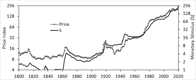
Figure 1. Price and monetary stimulus (S) over time
Figure 2 shows a plot of this moving regression trend line and the price index since 1790. Also shown is the ratio of the price to this trend value. Substituting the price trend for S in equation 3 and solving for V yields:
4. P = V ∙ Trend → V = P/Trend = PR
I call the ratio of price to trend the reduced price or PR. As suggested by equation 4, it can be thought of as something like a local value for monetary velocity. Figure 2 shows four peaks in reduced price and four troughs, defining four Kondratieff cycles. The first three are those Kondratieff cycles identified the raw price plot in Figure 1, but the fourth is only revealed by PR. Reduced price analysis shows a trough in 1946 and a peak in 1981, which exactly correspond to the interest rate extrema in those years. After reporting my findings to Longwaves participants, I was encouraged to write a book about my work with stock market and economic cycles. This was my first book Stock Cycles, my most successful and best received book.
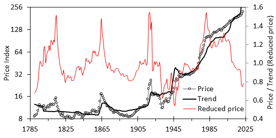
Figure 2. Price, price trend and reduced price 1790-2020
The recent extreme low in 10-year Treasuries in 2020 and the low in reduced price in 2021 suggests that we may have reached the Kondratieff trough in 2021, 75 years after the last one. This timing is consistent with the spacing of another Kondratieff feature, the fall from plateau, which happened in 2007 and previously in 1929, for a 78 year spacing. It seems like the Kondratieffs are considerably longer today than their classical 50-60 year length. I note that the 1981 peak was only 61 years after the previous one, and the 1946 trough was 50 years after the previous trough in 1896, implying that cycle length was getting longer. Twenty years ago, I believed this shift reflected an interaction with the Strauss and Howe generational cycle and wrote my second book about that.
The current inflation outlook
Because my entry into social science scholarship came through the economic long wave, inflation has played a central role in my thinking about politics and the economy. In my ultimately unsuccessful efforts to establish a solid empirical foundation for the long cycles I studied, I focused on price dynamics, as these were one of the few truly long-term series available in the literature back then. In addition, inflation, interest rates and other monetary issues played important roles in the early American political economy from Hamilton’s efforts to establish a central bank, to Jackson’s “war” on the Second Bank of the United States, and to the 1870’s Greenback and 1890’s Populist political movements.
According to Friedman and Schwartz’s monumental Monetary History of the United States, monetary factors played a major role on the development of the Great Depression. They suggested that had the Fed increased the money supply (as they did during the next crisis in 2008) the 1929-33 economic collapse could have been avoided (as happened in 2008). I lived through the 1970’s inflation which created an appreciation for the effects of inflation on savings, investment and on historical price comparisons. As I discuss here, I believe this inflation played a key role in how Democrats lost the working-class vote. So monetary factors have played a major role in politics throughout American history and a focus on them is warranted.
We are currently living through yet another era in which inflation is playing a major role. Today I have a potentially better analytical tool, the extension of reduced price to my money balance model, which links quantity of money to Phillips curve analysis. Figure 3 shows a plot of estimated NAIRU, obtained from the money balance, compared to the unemployment rate since 2010. As I understand it, standard Phillips curve analysis holds that when unemployment is below NAIRU inflationary forces are present, which, in the absence of a countervailing force like high interest rates, will cause price growth to accelerate (inflation rate increases). When unemployment is about the same or higher than NAIRU, inflationary forces are absent or may actually be deflationary. Price inflation will be stable or may fall.
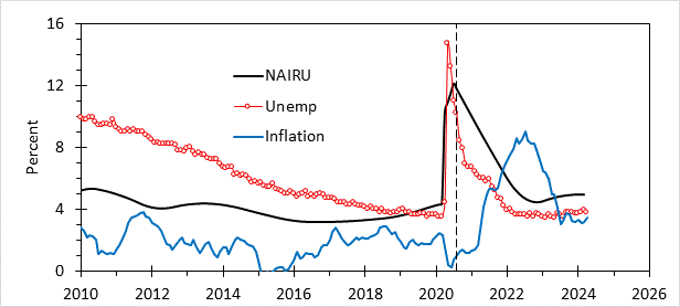
Figure 3. Estimated NAIRU (obtained from Balance), unemployment, and inflation rate since 2010.
Looking at Figure 3 we see that unemployment was consistently above NAIRU until 2019, during which the Fed maintained low interest rates in an effort to spur employment growth. Inflation rate averaged 1.8% over 2010-18 and the Federal Funds rate averaged 0.44%. In 2019 unemployment rate crossed NAIRU suggesting that some inflationary forces were beginning to manifest. The Fed was on the case and the Fed Funds rate averaged 2.1% over 2019 and the first two months of 2020. Inflation remained well controlled at 1.9%.
Then came the pandemic, and the wheels flew off the economy. The Fed implemented a large-scale QE operation to prevent a market crash and the Federal government responded with large-scale stimulus to prevent a depression. These actions served to massively increase Balance and estimated NAIRU. Unemployment rose dramatically with the shutdown, initially to higher than NAIRU, resulting in a brief period of deflation. But, as businesses reopened, unemployment began to fall. The dashed line in Figure 3 gives an idea when the inflationary environment shifted from deflationary to inflationary. A large gap between unemployment and NAIRU opened up, indicating the development of inflationary forces in the second half of 2020. Inflation began to rise from near-zero levels around the same time.
Figure 4 shows a more detailed view of recent inflationary dynamics. Shown as the inflation driver is the difference between NAIRU and unemployment rate. Also shown is inflation and the Fed Funds rate. Here the dashed line indicates when the Fed began to hike rates. The inflation driver moved upwards and inflation rose above its pandemic-depressed level in summer 2020. I need to point out that Balance (and hence NAIRU) is based on annual data, while the other data is monthly, so the calculated inflation driver is based on interpolated NAIRU values based on estimates that have their own uncertainty. The coarseness of the data means that the timing provided by the graph may be off by half a year or more. Balance for 2020-21 was very large, implying a high NAIRU, whereas it was significantly smaller over the next two years. So, there was a powerful spike in the inflation driver beginning in the second half of 2020, which diminished in 2022, before settling out at a positive value somewhat higher than in 2019.
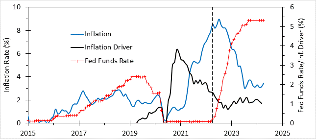
Figure 4. Inflation driver (NAIRU-unemployment), inflation and Fed Funds Rate since 2015
A test of the money balance model
I now come to the first real test of my inflation model. As Figure 4 shows, we have had a positive inflation driver for nearly four years now. This driver skyrocketed in mid-2020 to levels far above where it was before the pandemic. Inflation moved rapidly higher sometime later. In spring 2022, as inflation rate was approaching its peak, the Fed began raising interest rates at a rapid clip. Inflation fell as fast as it rose. During the inflation outbreak inflation driver was falling, implying dissipating inflationary forces, but it did not fall all the way back to zero or even to the value it had been before the pandemic. This suggests that inflationary forces are still present and renewed inflation remains a potential threat; the Fed cannot cut rates and call it a day, but will need to remain vigilant, perhaps even having to raise rates even more should inflation worsen.
In my April 15 post I noted that interest rate increases seem to be reducing excess demand for workers relative to unemployment rate (labor supply). This excess demand has fallen by 2.3 points over the last two years and if this trend continues, excess demand should vanish in the next 12-18 months, at which point, presumably, unemployment will begin to rise, suggesting the onset of recession late next year. The reader is directed to Pascal’s Newsletter for monthly excess demand updates to keep track of this. Since the money balance (and NAIRU) is likely to grow with rising deficits, we might expect the inflation driver to remain positive, meaning the Fed will be reluctant to cut rates for fear of reigniting inflation. The Fed is in a tough situation here and I see no easy way out without large-scale tax increases, which are off the table in an election year and after, should Republicans win in November. These predictions can serve as a test of the utility of my money balance model.
Comparison to the 1940’s inflation
In 2021, before I came up with the money balance model I use now, I argued that rising inflation was analogous to that in the 1940’s, not that in the 1970’s. My view was based on Kondratieff grounds and used the reduced-price concept discussed earlier (America in Crisis p184):
Some observers…fear we are heading into a situation analogous to the late 1970’s. This is highly unlikely. The late 1970’s was an inflationary environment, as indicated by a strongly rising reduced price―the end of a 35-year upwards trend. The current era is the opposite, a deflationary environment, as shown by a rapidly falling reduced price, the culmination of a forty-year downward trend. It is more like WWII, when wages and worker share were rising as a result of massive stimulus while reduced price was crashing. In Kondratieff terms, those who fear inflation are arguing that the past deflationary trend does not matter; a trend change from a deflationary environment to an inflationary one is in progress. That is, they are really arguing that we are at the Kondratieff trough―today is like 1946 and reduced price will soon start to rise.
Figure 5 shows the same type of analysis shown in Figure 4 for the 1940’s. At this early date, both the NAIRU and unemployment components are based on annual data so annual values of inflation driver are shown. Here inflation driver began to rise in 1941 with the effects from Lend Lease, and inflation rose with it. To squelch inflation would have required very high interest rates, which would have made it impossible to conduct the war. Keeping rates low in order to finance the war invited very high inflation like that seen after WW I. Hence the Roosevelt administration implemented price controls during the period denoted by the dashed lines.
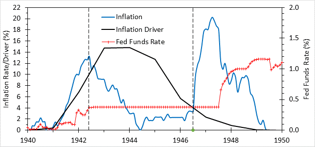
Figure 5. Inflation driver, inflation and Fed Funds Rate over 1940-50
Dashed lines indicate beginning and end of WW II price controls.
When controls ended, the inflation driver was falling, but it was still positive, and at about the same level it was at the beginning of 2022, when inflation was moving strongly up. The same thing happened here, with inflation spiking at 20% in 1947, at which point the Fed began to hike rates. As Figure 5 shows, as the federal deficit become a surplus in 1948, inflation driver vanished. In other words, the Truman administration, by keeping high wartime taxes in place while war spending fell, was able to return the economy in 1948 to a situation like in 2019, in which low unemployment, low inflation, and strong real wage growth occurred simultaneously. As a result, after losing Congress in 1946 as inflation took hold, Democrats recovered Congress and Truman won reelection in 1948 as inflation subsided. Further tax increases during the Korean war, which were retained afterward by the Eisenhower administration, kept inflation driver low (average 0.4) until 1965 when the 1964 tax cut sent inflation driver rising.
Did you see Scott Galloway did a new TED Talk? I stopped watching them when they became too woke and partisan, but WOW, this really puts TED back on the map!
I think part of the inflation debate issue is the measure. The measures contain the slow moving and lagged Owner's Equivalent Rent - both in CPI and PCE. If we were to use to European measure of inflation, we're already at 2%. Dealing with that question is paramount to determining the next actions by the Federal Reserve.