There has been a growing feeling that something is wrong with the direction America is heading since the turn of the century. The idea that we live in a time of crisis has gained currency over the past couple of decades. America is Crisis is an analysis of the political and economic dynamics responsible for this feeling. I use a cyclical concept, not William Strauss and Neil Howe’s generational cycle referred to in the previous link, but Peter Turchin’s secular cycle, with corrections that address some of the issues raised in the cited review. I believe a major driver of society is cultural evolution and talk about it a lot. There is also quite of bit of political, economic and financial discussion as I believe these disciplines are also very important. I wrote up my analysis in a book. America in Crisis substack covers some of the material in the book, plus new insights as they occur to me. For easier comprehension it may help to read posts in sequential order so that when an older post is referenced there is some familiarity.
This article uses a blend of inflation concepts to provide a different account of how the American economy evolved over the three-quarters of a century since the end of WW II.
Table 1 summarizes economic performance over the seven-plus decades since the end of WW II. This period is broken up into four eras: the postwar boom (1947-73), stagflation (1974-80), the Reagan boom (1981-2000) and the modern era (2001-21). Both the postwar and the Reagan boom showed similar rates of economic growth and inflation rates. But the former was able to translate growth into wage gains for the working class, while the latter era did not. It is possible that this was achieved because of efforts by policymaker to run the economy “hot” as evidenced by lower real interest rates and unemployment rates during the postwar boom. Both booms were followed by a bust: the stagflation of the 1970’s and the modern era of successive asset bubbles and crashes: the internet bubble and tech wreck of 2000-2, the real estate bubble and 2008-9 crisis, and present asset bubble and crash of 2022-23.
Table 1. Econ. perf. over time (%)
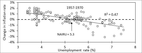
Inflation and its control play a significant role in the story told here. Two conceptions of inflation will be used. The first is known as the Phillips curve, which describes a tradeoff between inflation and unemployment. Figure 1 shows a plot of the rate of change in the inflation rate on the vertical axis versus the unemployment rate on the horizontal. The arrow in the figure shows that the trend line intersects with “0” on the vertical axis at 5.3% unemployment. This unemployment level is called the NAIRU, which stands for Non Accelerating Inflation Rate of Unemployment. Unemployment levels above NAIRU will tend to reduce the inflation rate, while levels below it will increase inflation.
Figure 1. Plot of change in inflation rate versus unemployment showing NAIRU
As the scatter in the figure suggests, these concepts are a crude approximation of a much more complex reality. Nevertheless, the concept has some utility in understanding the changes in economic performance over the years. To this end I constructed plots like this for selected periods and obtained NAIRU values from them which are given below:
Table 2. NAIRU values over selected periods
Period 1948-1957 1957-1970 1970-1981 1981-1990 1990-2001 2001-2020
NAIRU . . 4.0 . . . . . . 5.3 . . . . . .. 6.6 . . . . . . 6.4 . . . . . .. 5.3 . . . . . . ?
Table 2 shows that NAIRU values change over time, complicating the use of the Phillips curve.
The second inflation concept is known as the quantity theory of money (QM) which is just a money balance on economy:
1. P * rGDP = V * M —> P = V * S
Here P is the price level, GDP is real GDP, M is the money supply, and V is a parameter called the monetary velocity which is the rate at which money circulates through the economy. The product of V and M is a rate of money circulation, in dollars/year. Similarly, the product of P and rGDP is the nominal GDP, the amount of goods and services sold (at current prices) in the economy over the course of a year, which represents a rate of money exchange in dollars/per year. The equation simply says that for every unit of GDP sold at price P, a dollar was used to buy that unit. V is simply the number of times one of the dollars in the money supply (M) is spent over the course of a year. I develop this idea further in Appendix B of my book America in Crisis, in which I define a quantity called monetary stimulus (S) as equal to M/rGDP. S represents a measure of the “amount of dollars (M) chasing a fixed amount of goods and services (rGDP).” I use S to construct an inflation trend by which I divide the price series to obtain a trendless “reduced price” quantity useful for discerning price cycles relating to economic cycles.
This is not the objective here. Instead, I expand on the concept expressed in equation 1 by taking into consideration additional flows of money:
2. ΔP = V * (ΔS – D – B –T)
Here D and B refer to dividends and stock buybacks in dollars per year. These too are flow rates of money out of the “real” economy that produces goods and services into the financial economy. The idea here is that money “tied up” in investments isn’t really chasing goods and services and so the value of M in equation 1 should be reduced by the amount going into financial investments. Finally, T is the trade deficit, which is also a flow of money out the real economy. The way equation 2 is written implies that all of the money used for dividends and stock buybacks stays in the financial economy. This is not true, retirees typically spend their dividend income. On the other hand, working people put money into financial markets, which offset dividends withdrawn from the markets. It is more useful for this discussion to ignore V and focus the quantity in parentheses on the right-hand side of equation 2, which will determine the direction of inflationary forces. I call the quantity the (monetary) Balance (on the economy).
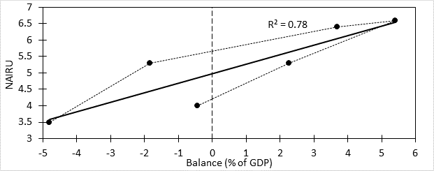
Basically, when Balance is positive then ΔP will be positive; inflationary conditions exist, much as when unemployment is below NAIRU. And when it is negative, then disinflationary conditions exist like when unemployment is above NAIRU. How these conditions factor into actual inflation is mediated through the value of NAIRU as was shown in Figure 1. The value of NAIRU is then affected by Balance as shown in Figure 2.
Figure 2. Plot of NAIRU versus average value of Balance
Figure 2 shows a plot of the NAIRU values from Table 2 against the average value of Balance for the corresponding period. The post-2001 period posed a problem. The Phillips plot I did for this period gave essentially a horizontal line, for which the NAIRU in undefined. The reader may recall news stories during the 2010’s describing the curious absence of inflation despite near-zero interest rates and falling unemployment. The absence of inflation was consistent with a low NAIRU. In this vein I assumed a NAIRU of not more than 3.5% in Figure 2, which corresponds to the lowest rate of unemployment seen prior to the pandemic.
The figure shows a positive relation between average value of Balance and the prevailing NAIRU. The dotted line connecting the points shows the relation between the points and time with time rising as one proceeds along the dotted line. Thus, the lower data point in the middle of the figure reflects the 1950’s situation. Time increases as one follows along the dotted line in a counterclockwise direction, going to the next data points in the sixties and seventies with successively higher values of balance indicating increasing inflationary conditions. After the inflationary seventies and eighties, balance started to come down and fell below zero in the nineties and has been well below zero since then with the exception of a handful of years, as will be discussed later in this article. Had I been able to calculate NAIRU values before 1948 and plot them in Figure 2, what would be seen is a dotted line looping around the trend line. These loops are called limit cycles and reflect the behavior of a dynamical system around an equilibrium relation governing the system interactions. The limit cycle in this case corresponds to what is called the Kondratieff cycle. I originally developed the concept of stimulus in order to identify these cycles in an unambiguous way, though they are not relevant to this discussion. This completes the introduction of the tools we will use. For the rest of this article, I present economic data over the periods used for NAIRU determination with commentary on what was going on.
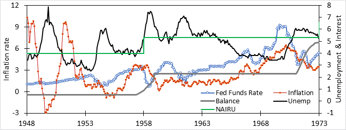
Figure 3. Economic data over 1948-1973
Figure 3 shows the 1947-1958 period. The green line shows the value of NAIRU for the period, while the heavy gray line shows the average level of Balance. The upwards shift in Balance in the late 1950’s reflects the adoption of persistent deficit financing starting in 1958. This shift changed the operation of the economy to one consistent with a higher NAIRU. Although the level of unemployment during 1948-58 at 4.5% was lower than the 5.0% average value over 1958-73, it was 0.5% higher than the 1950’s NAIRU (and hence inflation-suppressing), while the latter was 0.3% lower than 1960’s NAIRU (and hence inflation-enhancing). As a result, inflation, which had not been a problem in the fifties, became one as the sixties progressed.
Of course, policymakers operating in real time cannot know that the NAIRU has shifted. NAIRU can only be determined in hindsight by performing a Phillips-type analysis like that shown in Figure 1. Although NAIRU seems to reflect balance, the raw value of balance fluctuates a lot and is presented in a heavily averaged form in Figure 3. However, there did exist a near-real time indicator that things had become amiss after 1958. Back then the inflationary effect of money creation and trade surplus largely canceled out the deflationary effect of dividends in Balance (there were no stock buybacks then) so that the main factor affecting Balance was the fiscal deficit.
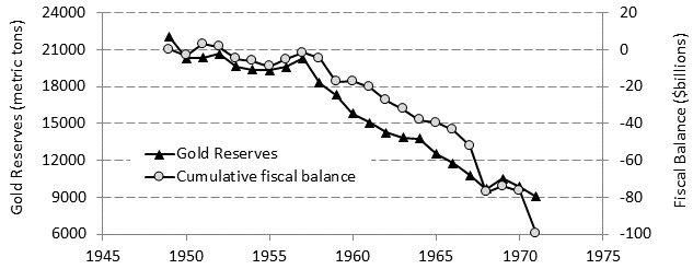
Figure 4. Trajectory of gold reserves and cumulative federal deficits over 1949-71
Figure 4 shows a plot of the cumulative fiscal deficits (indicative of a positive Balance) and the declining level of gold reserves. The two plots follow each other, suggesting that the trajectory of the gold reserves could serve as a real-time indicator of how the balance was changing and so how NAIRU was changing. What gold flows represent is the opinion of foreign central bankers on whether it is better to hold dollars or gold as reserves. Under deflationary conditions (i.e., when Balance is negative, as it was before 1958, using dollars makes more sense since dollar reserves are typically held as interest-earning government securities. In contrast, under persistent inflationary conditions (i.e., when the trend in Balance shifts to positive, as happened after 1958), a falling real dollar might make holding gold preferable to dollars. The flow of gold out of Fort Knox shown in Figure 4 provided a near-real time assessment that NAIRU was moving up, inflation was coming, and American policymakers needed to do something about deficits. I discuss this is more detail in chapter 4 of America in Crisis.
Since policymakers ignored the signal being sent by declining gold reserves, Balance and NAIRU were higher in the 1960’s. After the end of gold convertibility in 1971, the price of gold exploded upward, fueling expectation of future inflation. Despite this looming inflationary threat, policymakers saw fit to terminate the surtax implemented in 1969, which had generated a fiscal surplus and small recovery in gold reserves (see Figure 4). Instead the followed the 1969 surplus with decades of budget deficits, allowing Balance (and NAIRU) to rise in the 1970’s as shown by Figure 5. Despite the application of higher interest rates leading to higher average unemployment of 6.7% in the 1970’s, this did not produce a strongly disinflationary condition, given the NAIRU of 6.6%. As a result, inflation would continue to be a problem throughout the decade.
Figure 5. Economic data over 1970-2000
The inflationary threat promised by the response of the gold price after Nixon closed the gold window became manifest in the massive OPEC price increase in 1973. The American economy fell into a recession during which prices continued to rise, a phenomenon dubbed “stagflation.” Dealing with stagflation required the Fed to raise the Federal Funds rate to nearly 13% in 1974, pushing unemployment more than 2% above the 6.6% NAIRU in order to quell inflation (see Figure 5). The response by policymakers in Congress and the White House was to continue to run enormous deficits amounting to 2.6% of GDP for the rest of the decade. Balance remained strongly positive and NAIRU high, meaning another bout of inflation was to come as unemployment fell below NAIRU. The high value of Balance and NAIRU meant that unemployment which twenty years earlier was present only during recessions would have to become normal all the time if inflation was to be under control.
It was Federal Reserve chief Paul Volcker who implemented the new normal of constant recessionary unemployment when he raised interest rates to an average value of nearly 15% over 1980-1981, which pushed unemployment above the NAIRU for seven years (see Figure 5). When unemployment finally moved into something that resembled full employment in the late 1980’s, the inflationary response was muted compared to the 1970’s experience. What had happened was Balance had begun to fall dramatically. The value of Balance over in the 1987-90 period of relatively low unemployment (5.6%) was about +1, much lower than its value of +5.2 over the 1978-79 period of relatively low unemployment (6.0%).
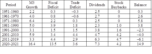
The decline in Balance did not reflect any sort of return to fiscal responsibility on the part of the Republican administrations. Far from it, average deficits over 1987-90 were 3.1% of GDP compared to 2.0% over 1978-79. What had happened was the increased importance of money flows other than the fiscal deficit. This is illustrated in Table 3. Of particular interest is a comparison 1951-60 with 2011-19. Both periods saw moderate rates of M3 money creation, 2.2% and 3.3%, respectively. Fiscal deficits offset by trade deficits were also similar at 0.6% and 1.5%. Adding these factors together gives +2.8% versus 4.8%, suggesting the Fed and government policymakers were running a somewhat more inflationary policy during the latter period when compared to the former. This does not consider financial flows. When these are included, the later period was far more deflationary than the former. Inflation was simply nowhere to be seen.
Table 3. Average money flows making up Balance by decade.
And yet, immediately after the 2011-19 period, massive money creation and fiscal deficits completely overwhelmed these deflationary financial flows, producing a highly inflationary condition as indicated by a Balance of nearly 15, the highest seen since WW II. This extreme situation then disappeared as fast as it appeared with Balance returning to about –3 in 2022. The result of this enormous spike in Balance would be a sharp increase in NAIRU making the low unemployment rates in 2021 way below NAIRU (and highly inflationary) instead of above it (disinflationary) as they had been in 2019, resulting in a spike in inflation. This led the Fed to increase interest rates. Before these increases have had time to affect employment, inflation has started to drop rapidly, presumably reflecting the decline in Balance (and NAIRU) in 2022 so that employment rates that just months earlier were inflationary are not anymore.
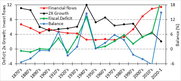
Figure 6 provides a long-term summary of Balance and some of its key components as decadal averages since 1871. Several trends stand out. One is the enormous rise in financial flows out of the real economy in recent decades. Another trend is the change in the relation between fiscal deficits and Balance. Up until the 1970’s, Balance and fiscal deficits moved together, implying that control over Balance (and hence, NAIRU) could be achieved by controlling government fiscal balance. Over this period, whenever the federal budget was close to balance or surplus, inflation was low (avg value -0.4%, max 2.1%). When it was not, inflation was much higher (average 6.2%, max 8.4%). The “October Revolution” in Federal Reserve policy brought about by Paul Volcker changed this. Subsequently, Balance and fiscal balance were uncoupled. Inflation control was achieved in the 1980’s by high unemployment rates while rising trade deficits and financial flows increasingly offset money creation and fiscal deficits. The 1990’s saw a brief return to pre-revolution orthodoxy with reduction in fiscal deficits, which were coupled with increased financial flows. Fiscal orthodoxy was abandoned after 2000, and inflation control since then has been achieved solely by increased financial flows.
Financial inflation control is problematic since it withdraws output from the economy that cannot be used for either worker compensation or investment, the two largest components of aggregate demand, which produces the impetus for economic growth. More importantly, eschewing investment in productivity-enhancing capital in favor by buying financial assets leads to a reduction in productivity growth leading to economic stagnation, as depicted by the recent decline in economic growth in Figure 6.
Rising financial flows has not been some new inflation-control strategy on the part of economic policymakers in Congress, the White House, or the Federal Reserve. It is something that has simply evolved over time. The idea of evolutionary change in economic culture over time forms the core of the analytic framework presented in America in Crisis. Chapter 3 of the book introduces the discipline of cultural evolution and uses it to explain the trajectory of economic inequality over the last century. Business/economic culture is considered as a mix of “stakeholder capitalism” (SC) and “shareholder primacy” (SP). Chapter 4 describes how rising SP culture, the Fed policy revolution, and a tax-cutting Republican hegemony combined to produce a financialization of the economy, which has produced the rising financial flows. This has led to a crisis in capitalism that began around 2006, which resembles a similar crisis a century earlier which is discussed in chapter 2. Such crises, if not addressed, can lead to dark places, which is a topic for a future post.


